What UX/UI design is and how it differs
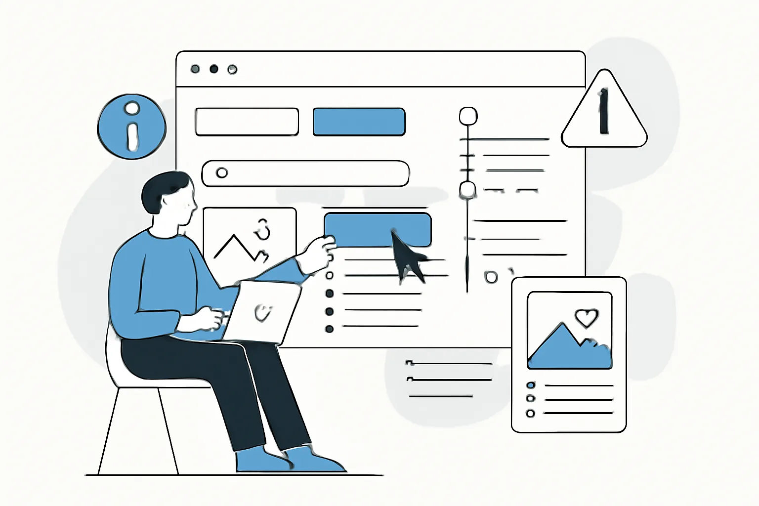
UX and UI often go hand in hand, but they serve different purposes. If you’re asking what is UX UI design, the short answer is that UX is about how a person moves through a product: what they see first, where they make mistakes, and at which step they abandon a form. UI is about how that journey looks: buttons, spacing, fonts, colors, and states. In practice, effective UX/UI design happens when these two parts work together instead of fighting each other.
Imagine ordering food in an app. If the menu is confusing and the filters are hidden, the UX is weak. If the “Place order” button gets lost among banners, the UI is failing too. And vice versa: even a beautiful screen won’t help if the user doesn’t understand what to do next.
There is a simple rule of thumb. UX helps a person reach their goal in fewer steps, which is one of the key UX UI design principles. UI makes those steps clear and visually tidy. When a product is built without that connection, extra clicks, mistakes, and frustration appear — usually already by the second or third screen.
Why effective UX/UI design matters for businesses and users
A good interface saves time. A bad one takes it away. For the user, that means fewer errors, fewer repeated actions, and fewer reasons to close the tab. For a business, it means more predictable behavior on the website or in the service, and sometimes less pressure on support.
Usability also affects trust. If a payment form breaks at the final step, people rarely look for the cause. They simply leave. If an account dashboard requires six extra actions for a routine task, people don’t want to come back, even if the product itself is useful.
In projects with complex logic, effective UX/UI design helps avoid hiding meaning behind decoration. This is especially noticeable in services with dashboards, analytics, or subscriptions: what matters there is not “beauty for beauty’s sake,” but fast access to the 3–4 main actions. In similar tasks, Ostohlo often discusses this together with site architecture; for reference, see Corporate Website: Structure That Actually Works.
Core principles of effective UX/UI design
The first principle is logic. If a user is looking for a profile, they should find the profile, not “account settings” in an unexpected tab. Logic saves attention. This becomes especially clear in longer user journeys.
The second principle is simplicity. Not because the design should be poor, but because unnecessary elements get in the way of action. Simplicity does not mean emptiness. A screen can have 12 elements and still be fine if each one has a purpose.
The third principle is visual hierarchy. One screen should not be shouting with ten voices at once. The primary button, heading, explanation, and secondary step should differ in weight, size, and placement. When they don’t, the user wastes extra seconds trying to make sense of the scene.
The fourth principle is consistency. The same actions should look the same across five screens in a row. If the confirmation button is blue on one step and gray on another, people start to doubt. Small confusion quickly turns into mistrust.
The fifth principle is accessibility. Text contrast, tappable area size, readability on mobile, and keyboard support matter not only for people with limitations, but for everyone else too. On the subway, in bright sun, using one hand — that is accessibility too.
The sixth principle is user orientation. Not the team’s taste, not the manager’s habit, not “how we did it in the last project.” The person’s goal is always at the center. Otherwise, the interface starts serving internal processes instead of the product.
Stages of creating UX/UI design
The UX UI design process usually begins with audience research. You need not abstract “users,” but specific groups: beginners, regular customers, administrators, mobile shoppers. At this stage, interviews, session recordings, support ticket analysis, and an understanding of where people get stuck most often are important.
Then the tasks are defined. You can’t design a “convenient interface” in the abstract. You need concrete scenarios: registration, product search, payment, repeat order, report export. If the product has seven scenarios, two or three usually get priority, and that’s normal.
After that, a prototype is created. On paper, in Figma, or in any other tool, but initially without extra visual polish. The prototype is there to test the route. It makes it especially clear where the user takes four unnecessary steps and where the path can be shortened without losing meaning.
Then comes the UI design stage. That’s where components are assembled, spacing and grids are set, button states, form errors, and notifications are defined. And yes, small details matter: if an error message appears too low or disappears after two seconds, the user won’t understand what to fix.
The final part is testing and refinement. It’s better to find five problems in a prototype than fifty after launch. At this stage, it helps to compare not only appearance but also behavior: how long it takes to complete a task, where users hesitate, what they do after an error. If needed, the team goes back a step and changes the logic.
Common UX/UI design mistakes
The most common mistake is overload. There are too many banners, cards, icons, and text on the screen. As a result, the user can’t see any of the main elements. This happens especially often on homepages, where people try to show “everything at once.”
The second mistake is unclear navigation. When menu items are named in the team’s internal language, people have to guess. A section called “Solutions” can mean anything. It’s better when labels say it directly: “Pricing,” “Documents,” “Order history.”
The third mistake is weak feedback. A user clicks a button and can’t tell whether the action worked. The screen stays silent, the spinner runs for too long, the form doesn’t report an error. In that situation, even a good product looks broken.
The fourth mistake is inconsistency between elements. Different spacing, different button sizes, different heading styles. This is not only about aesthetics. Inconsistency makes the interface harder to learn because the brain has to relearn the screen every time.
The fifth mistake is ignoring the mobile version. For many services, most traffic comes from phones. If buttons overlap on a small screen and the form requires horizontal scrolling, the product immediately loses part of its audience.
How to evaluate UX/UI design effectiveness
Evaluation starts with observation. If a person completes the main scenario without hints, that’s a good sign. If they stop at the second step, ask where to click, or go back, the interface needs improvement.
There are also quantitative indicators. Look at task completion, the number of form errors, click depth, time to target action, and bounce rate. Numbers alone don’t tell the whole story, but they show where the interface breaks the user journey.
Qualitative signals matter too. When people describe the product with words like “clear,” “fast,” and “doesn’t get in the way,” that’s a good sign. When you hear things like “looked for it for a long time,” “didn’t see the button,” or “didn’t understand what went wrong,” the design needs a rethink. One comment can highlight three problems at once.
In teams that work systematically, it’s also useful to look at repeat visits. If users come back, that says not only that the product is valuable, but also that they don’t experience extra friction when using it again. In analytics products, for example, this logic is easy to connect with monitoring; see the case study Astrina — a website analytics & monitoring platform · Ostohlo case study.
Tools and methods UX/UI designers use
Prototyping is a basic tool. Without it, it’s easy to argue about taste and hard to argue about the user’s path. A prototype helps quickly test two or three screen versions and avoid polishing something that will be removed anyway.
User interviews provide a real-world picture. They show how people describe their problems in their own words. This is especially valuable when the team has already grown used to internal terminology and no longer notices that it doesn’t work for the market.
User journey maps help you see the full scenario as a whole. Where the person arrived on the site, where they got distracted, where they returned, where they left. Sometimes that overview makes the obvious clear: at the registration stage, the user runs into four unclear fields, and then the team wonders why conversion drops.
A/B testing is used when there are two options and the goal is not debate but validation. You change the heading, block order, button text, or form placement. Without testing, it’s easy to fall in love with a version that performs worse for real users.
Design systems keep the interface organized. Components, states, spacing rules, typography, and colors are gathered in one place. That reduces chaos, speeds up work, and makes handoff between design and development easier.
How to implement effective UX/UI design in a project
It’s best to start with short iterations. You don’t need to wait for a full redesign if the problem is visible right now. You can take one scenario, such as checkout, and improve only that. Often that’s enough for the team to see the effect in the very next sprint.
Next, it’s important to agree on criteria. What does “convenient” mean? How many steps are acceptable? Where must the user see the error? What are the two main actions on the screen? Without answers to these questions, the designer creates something beautiful, and the team later argues about the result.
It’s useful to involve development and support early. A developer will see in advance where the interface is technically complex. Support will point out the questions people complain about most often. Sometimes the same menu item triggers 15 identical requests, and that’s a direct signal to redesign it.
A good practice is to run regular mini-tests after every change. Don’t wait for a major release. Check one or two scenarios, collect feedback, fix issues, and test again. This cycle is better than infrequent large rewrites, because the product doesn’t have time to accumulate chaos.
If the project involves security, payments, or private data, the interface should be especially clear. People want to understand where they are entering data, who can see it, and what will happen after the button is pressed. In these scenarios, usability cannot be separated from trust; for a related topic, take a look at website security.
And one more practical step: don’t delay interface support after launch. The first release almost never answers every question. Users start working with the product, the team gets real behavior patterns, and that’s when it becomes clear where the next round of improvements is needed. This approach is discussed separately in website support pricing.
