What is a SaaS website structure, and how is it different from a typical corporate website
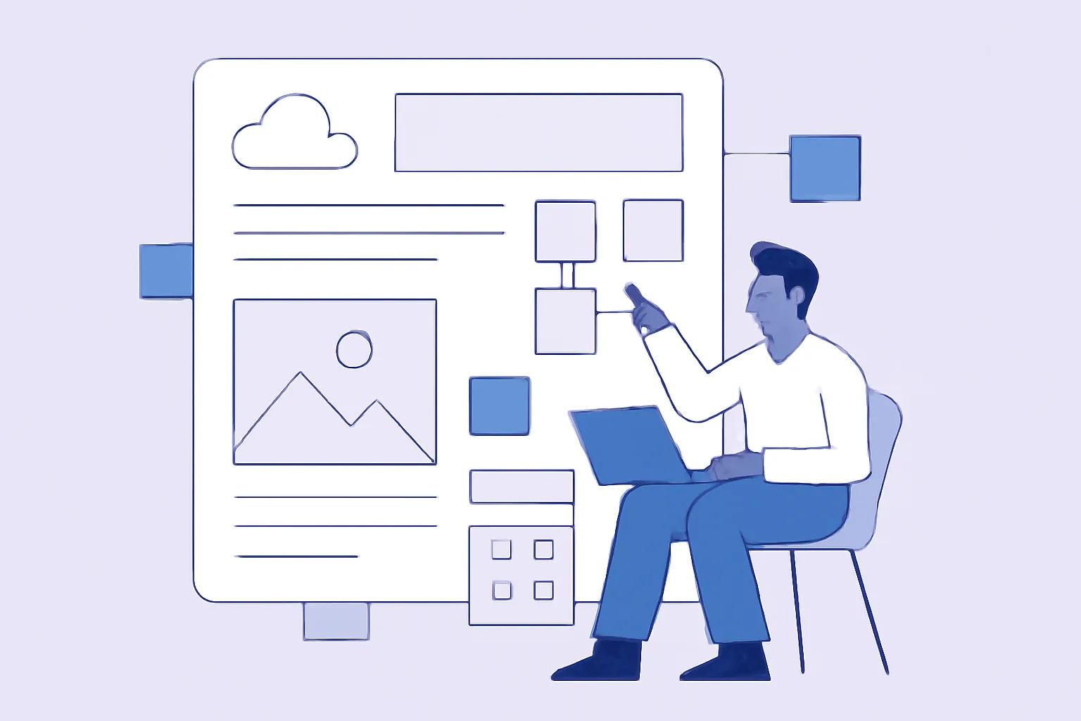
A SaaS product website structure is more than just a menu and a set of pages. In essence, it’s the path a user takes from first contact to action: request a demo, sign up, start a trial, or pay for a plan right away. If the site is put together well, it helps sell on its own: it explains who the product is for, what pain it solves, why it can be trusted, and what to do next.
For a standard corporate website, the goals are often broader and less defined: present the company, talk about services, showcase experience, collect inquiries. A SaaS site usually has a tighter logic. Here, the aim is not to “say everything,” but to quickly guide the person through a few key questions: what is this product, is it right for me, how is it better than alternatives, how much does it cost, and how do I get started? That’s why the structure of a SaaS product website matters, rather than a one-size-fits-all site scheme.
Lead qualification is especially important for SaaS. One visitor is looking for a free tool for a two-person team, another needs a platform for a sales department, and a third wants an enterprise solution with security, roles, and audit logs. If all of them land on the same anonymous page, conversion usually suffers.
There’s also an important difference between models. In B2B SaaS, the site often works as a long persuasion cycle: the user needs explanation, comparison, case studies, security details, integrations, and a demo. In self-serve models, the focus shifts to ease of start: minimal friction, a clear above-the-fold message, and a fast path to registration. In a product-led approach, the site often serves not only as a storefront but also as part of the product — encouraging self-guided exploration and the first success.
That’s why a SaaS website structure should be designed not by habit, but around real usage scenarios. It helps to think of it as a working system where each section does its own job. By the way, this is also worth keeping in mind when organizing sections in general — if you need a reference for corporate website logic, you can look at corporate website structure, but SaaS has its own more practical mechanics.
SaaS website architecture: core sections and user journey logic
A strong SaaS website architecture is usually built around several core sections. They don’t have to appear in exactly the same order on every project, but the set is usually similar.
- Home page.
- Product.
- Solutions or use cases.
- Pricing.
- Case studies.
- Integrations.
- Security.
- Blog or resource center.
- Contacts and contact forms.
The home page should be a short but informative entry point. Its job is not to retell the whole site, but to help the visitor orient themselves quickly. Usually, the first screen includes a clear offer, a short value statement, and one main CTA: “Request a demo,” “Start free,” or “See the platform.” The second screen can expand on key benefits, followed by proof, scenarios, product blocks, and links to deeper pages.
The “Product” section is for people who already understand the idea and want to see how it works. Here you show the interface logic, main features, workflows, and scenarios. For complex services, separate pages for individual modules are useful: that’s better for users and also helps search traffic.
The “Solutions” or “Use cases” section answers the question of who the product is for. For example, you can segment by role, industry, or task: for marketing, for sales, for support teams, for fintech, for e-commerce. This approach reduces abstraction and helps visitors recognize themselves in the description faster.
The “Pricing” page is one of the most underestimated. In SaaS, it should not be decorative. Even if exact pricing can’t be shown yet, you still need to explain pricing principles, differences between plans, and what exactly is included in each package. When pricing is hidden, people often leave not because the product is expensive, but because they don’t know what to compare it with.
Case studies, integrations, and security are better not hidden in the footer. These are standalone arguments. A case study shows how the product works in real life. Integrations reduce fears about implementation. Security confirms that the service can be used in a working environment, not just in test mode.
The user journey usually goes like this: the person lands on the home page, then moves to the product or to the solution that fits their task, checks case studies or pricing, verifies trust, and only then clicks the CTA. Sometimes the path is shorter: ads lead directly to a landing page, while SEO traffic goes to a detailed feature or integration page. In a good architecture, both paths complement each other instead of getting in the way.
SaaS landing pages: what blocks they should contain
A SaaS landing page is not just a lighter version of the website. It’s a separate landing page with one goal and one persuasion logic. It’s needed when you’re promoting a specific segment, a single feature, an integration, an industry solution, or an ad campaign. A generic homepage is often too broad for that, which is why SaaS landing page blocks need to be planned with a clear purpose.
A full SaaS landing page usually includes these blocks:
- Unique value proposition above the fold.
- Pains and benefits.
- Product demo.
- Social proof.
- Features and use cases.
- Pricing or start format.
- FAQ.
- Repeat CTA.
The first screen should answer the question “what is it, and why do I need it?” Precision matters more than fancy wording. If the product speeds up team work, say that. If it cuts down on manual operations, that should be obvious right away. A vague offer like “We help businesses grow” is almost always a weak start for SaaS.
Next comes the pain-and-benefit block. This is where you show that you understand the user’s real context. Not abstract “we improve processes,” but concrete problems: slow approvals, lost leads, messy access management, manual reporting, duplicated data. And next to each problem — how the product solves it.
The product demo can take different forms: screenshots, short videos, interactive tours, animated scenarios. The main thing is not to overload the visitor. They don’t need art; they need the feeling that they almost already get it.
Social proof includes testimonials, logos, mentions, case studies, usage numbers, and customer quotes. A good landing page doesn’t just say “we’re trusted,” it shows who trusts the product and why. When the product is complex, it’s better to use short, specific proof points rather than general statements: “cut response handling time,” “brought transparency to the team,” “brought all channels into one place.”
The feature block is there to turn interest into understanding. It’s useful to show 3–6 key capabilities rather than the full list of every button. If there are many features, it’s better to move part of the content to separate pages. The same applies to integrations, modules, and industry-specific use cases.
Pricing on a landing page can be presented in different ways. Sometimes “starting from” plus a short explanation is enough; sometimes a comparison block is needed. The key is that the visitor should not feel like something is being hidden. Even if exact pricing comes through a demo, the person should still understand how entry into the product works.
FAQ is not a formality. It’s where you can remove objections: is there a trial period, how does implementation work, can data be migrated, what about support, how fast can you start? And yes, this is often where the last doubts get resolved.
The repeat CTA should appear after the main arguments and again at the end of the page. It’s better if the wording changes based on the goal: “Get a demo,” “Create an account,” “See it in action.” The same SaaS product can use several landing pages — for industries, for features, for different awareness levels. That’s normal practice, not overkill.
How to connect the home page, product pages, and landing pages with each other
One of the most common SaaS website problems is a disconnect between pages. The home page lives its own life, the product pages theirs, and the campaign landing pages theirs. The user moves between them but doesn’t feel any coherence. And that hurts both conversion and SEO.
It’s better to define page roles in advance. The home page is for overall positioning and navigation. The product page is for detailed explanation. The solutions pages are for specific scenarios. Landing pages are for narrow segments and campaigns. The idea is that no single page tries to replace all the others.
Connections between pages should be built through meaningful transitions. The home page can link to product, solutions, case studies, and pricing. The product page naturally links to case studies, security, FAQ, and integrations. A landing page can point to a deeper product page if the visitor needs more detail, or straight to a CTA form if the campaign context calls for quick action.
Internal linking is especially important here. It helps both people and search engines understand the structure. For example, a blog post can explain a problem and then lead to a solutions page. An integration page can link to the relevant product module and to a case study where the integration was already used. This turns the site into a network of connected arguments rather than a pile of separate pages.
If you want a more practical view of how a site should live after launch and not fall apart into disconnected pieces, it’s worth reading the material on website maintenance after launch. For SaaS, that matters especially: the structure shouldn’t “freeze” after publication; it grows with the product.
Which elements increase trust in a SaaS website
In SaaS, trust is not decoration — it’s part of the funnel. Visitors need to feel that the product won’t disappear tomorrow, their data won’t vanish, and the team really knows how to support customers. That’s why trust-building blocks should be planned in advance.
- Client or partner logos.
- User testimonials and quotes.
- Case studies with specific usage context.
- Security and data protection sections.
- Compliance with requirements and standards.
- Documentation, knowledge base, API materials.
- SLA and service-level description.
The best place for logos is near the first strong argument or immediately after the first screen, once the user already understands what the product is. Testimonials work well near the CTA or after the feature block. Case studies are best as standalone pages, but landing pages should still include short previews with links through to them.
The security block is especially important for B2B and for products that handle data, access, payments, or integrations. There’s no need to overwhelm visitors with technical jargon here. It’s better to explain simply: how data is stored, who has access, how authorization works, and what’s in place for backups and logging. If security is critical for your SaaS, it helps to draw inspiration from approaches in materials about website security: trust is built on transparency, not big promises.
Documentation and SLA are especially valuable for mature B2B products. When a client has IT, procurement, or a security team, these materials can settle the question faster than any ad copy. They may not be visible on the first screen, but they should be easy to reach from the main sections.
Common SaaS website structure mistakes
The most common mistake is an overly broad offer. When the site talks about everything and nothing, users can’t quickly understand what makes the product strong. It’s especially bad when different pages use different value statements: one on the home page, another on the landing page, and a third in the blog.
The second mistake is a lack of segmentation. If all visitors are pushed into the same scenario, the site loses effectiveness. SaaS almost always serves different user groups: business owners, team leads, analysts, marketers, operations managers. Each has a different context and different triggers.
The third problem is a weak CTA. Sometimes the button exists, but it’s too generic or appears too early. The user hasn’t understood anything yet, and they’re already being asked to “leave a request.” At the other extreme, the CTA is buried so deep that people never reach it.
The fourth mistake is confusing the product with the company. The visitor comes looking for a solution to their problem, but lands on a page about brand history, mission, values, and general statements. Those are useful things, but they shouldn’t replace product logic.
The fifth is an overloaded landing page. When one page tries to squeeze in all features, all case studies, all pricing, all integrations, and half the blog, the reader gets tired. In SaaS, this is especially noticeable: product complexity does not justify presentation complexity.
And finally, there’s a lack of proof of value. If the site promises growth, savings, or efficiency, it needs to back that up with scenarios, case studies, demos, and clear examples. Without that, even a good product looks like just another pretty interface.
How to adapt the website structure for SEO and conversion
SEO and conversion should not conflict in SaaS. Problems start when a site is built only for search engines or only for sales. In the first case, you get long texts without meaning. In the second, you get beautiful but too narrow pages that barely attract organic traffic.
The right approach is to separate commercial and informational pages while tying them together with a shared logic. Commercial pages handle the product, solutions, pricing, integrations, security, and case studies. Informational pages handle the blog, guides, comparisons, term explanations, and usage scenarios. That way, the site can capture different levels of demand.
For SEO, separate landing pages for features, integrations, and industry use cases are especially useful. A visitor may search not for the brand itself, but for a specific task: report automation, CRM integration, access control, channel analytics, lead management. If there’s a substantial page for that, the site gets additional entry points from search.
But it’s important not to create pages without a system. Every landing page should have its own purpose, its own query, its own CTA, and its own place in the structure. Otherwise, you end up with a chaotic set of nearly identical pages that helps neither rankings nor users.
For conversion, it helps to keep a few principles in mind:
- one main message per page;
- a clear path to action;
- proof near objections;
- clear navigation between sections;
- minimum unnecessary clicks at critical stages.
A strong SaaS website can be both persuasive and search-friendly. It doesn’t throw words around, but it still gives enough context for a person to make a decision.
