How to make a website accessible and what WCAG compliance means
Learn how to make a website accessible and what WCAG compliance means with audits, structure, keyboard access, and practical fixes.
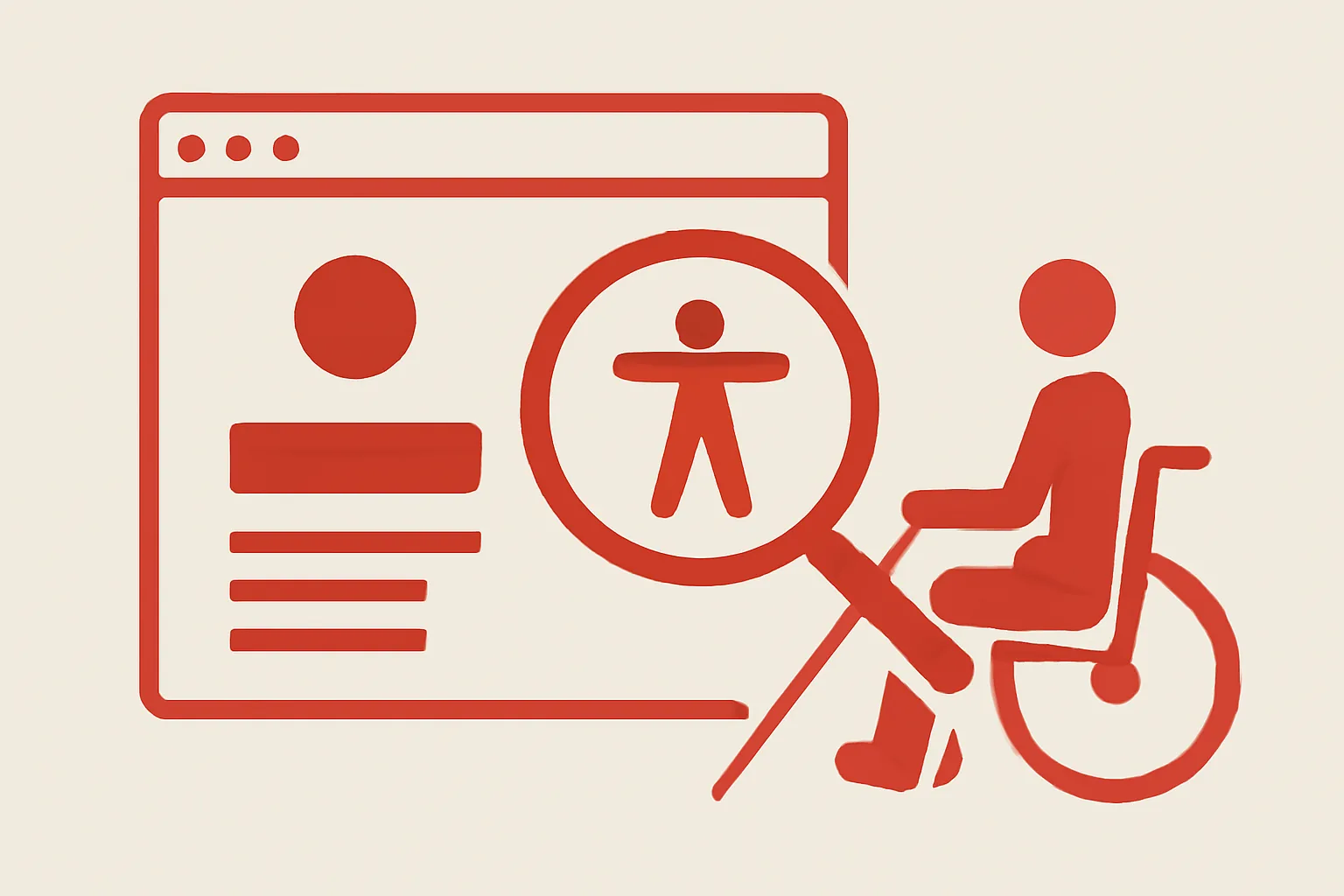
What Website Accessibility Means
Website accessibility means people can use a site without fighting it. A screen reader user, a keyboard-only visitor, someone on a phone in bright light, and a person with low vision all meet the same page with different needs, and the page should still work for each of them.
That sounds simple. It rarely is.
A good accessibility approach does not start with technology alone. It starts with one question: can a person complete a task in 3 clicks, with a mouse, with only a keyboard, or with assistive software? If the answer is no for even one path, the website is harder than it should be.
Accessibility also helps ordinary users in ordinary situations. A caption helps someone in a noisy train station. Clear focus states help someone who lost track of the cursor. Good headings help a reader scan a long page in 20 seconds instead of 2 minutes.
Teams often treat accessibility as a special feature. That is the wrong shape. It belongs with structure, text, forms, media, and navigation. If you have already worked on a corporate website, you already know that structure affects every page; accessibility just makes that structure usable by more people.
What WCAG Compliance Means
WCAG stands for Web Content Accessibility Guidelines. It is a published standard for making web content more accessible, and people often speak about WCAG compliance as if it were a single switch. It is not.
WCAG compliance means a website meets the relevant success criteria at a defined level. Most teams aim for AA because it balances practical effort and real-world impact. A site can be partly compliant, almost compliant, or fully compliant depending on what has been tested and what still fails.
There is also a difference between following some guidelines and following the standard as a whole. A page with alt text on images but broken keyboard behavior is not “accessible enough” just because one box is checked. A site with beautiful contrast but unlabeled form fields still leaves people stuck at the point of action.
Think of WCAG compliance as a discipline, not a badge. The standard gives you testable criteria, and those criteria help teams avoid vague promises. If a review mentions “how to make a website accessible and what WCAG compliance means,” it should connect the two: one is the practical work, the other is the standard that measures it.
Start with an Accessibility Audit
An accessibility audit gives you the first list of problems. Start with a sample of 10 to 20 important pages, not the whole site at once, because the common barriers usually repeat: missing alt text, low contrast, keyboard traps, unlabeled forms, and headings that jump from H2 to H4 without any reason.
Use both automated checks and human review. Automation catches patterns fast, but it will not tell you whether a button label makes sense in context or whether a modal closes cleanly. One quick manual test with a keyboard can reveal more than 50 automated alerts.
Check images one by one. Decorative images should usually be ignored by assistive tech, while meaningful images need alt text that says what matters. “Chart showing 2024 sales growth” is better than “chart,” and “Team photo” is better than “image123.”
Forms need special attention. Every input must have a clear label, not just placeholder text, because placeholders disappear when people start typing. A login field without a label becomes a guessing game. That is a failure at the first step.
Audit headings with a simple map. A page should not use headings for styling alone, and a user should be able to skim the outline in order. If the structure is messy, the page is harder for screen reader users and also for anyone trying to read fast.
Build Accessible Content Structure
Accessible content structure starts with semantic headings. Use H2s for main sections and H3s for subtopics. The point is not decoration; it is navigation. Screen reader users jump by headings, and a clear outline lets them move through a page in seconds instead of reading every line.
Page organization matters just as much. Put the main task near the top, keep related content together, and avoid scattering key actions across five unrelated blocks. One clear path is better than three competing ones. A messy layout can make a simple action feel like a puzzle.
Links should say where they go. “Read more” is weak on its own. “Read more about website support after launch” tells the user what they will get, and that matters when a page contains 12 links. Use descriptive text every time the destination is not obvious from the surrounding sentence.
For a practical example, compare “download” with “download the accessibility checklist PDF.” The second version is longer, but it is usable. In a screen reader link list, the extra words are not fluff; they are the map.
Alt text should be meaningful, not theatrical. A product photo might need the product name and one distinguishing detail. A screenshot may need a short explanation of the interface state. A decorative flourish can remain silent. That distinction saves time for users who hear every image description in sequence.
Readable copy matters too. Short paragraphs help. Plain terms help more. If a sentence is doing the work of a paragraph, split it. If a sentence has three ideas, give it 2 sentences. Screen readers can handle long content, but human attention still has limits.
A page built this way also supports content-heavy projects, including a content portal on investing, where users need quick scanning, clear sectioning, and terminology that does not shift from page to page.
Make Navigation and Controls Keyboard-Friendly
Keyboard access is not optional. Menus, buttons, dialogs, and forms must all work without a mouse. If someone can tab to a control but cannot activate it, the control is broken.
Test tab order first. Press Tab through the page and see whether focus moves in a logical sequence from top to bottom, left to right. If the focus jumps to a hidden element, or skips a key button, the page needs adjustment. Focus visibility matters just as much; if you cannot see where the keyboard is, you are guessing.
Dialogs need an Escape key or another clear close action. Focus should move into the dialog when it opens, then return to the trigger when it closes. Without that behavior, keyboard users can get trapped or lost. Nobody wants to press Tab 18 times to find the exit.
Menus should open and close predictably. A hover-only menu is not enough. A dropdown that depends on a mouse pointer can shut out keyboard users and touch users at the same time. The rule is simple: if a control exists, it should be operable in more than one way.
Forms deserve one more pass. Error messages must appear near the field, use clear language, and be tied to the field itself. A message that only says “invalid input” helps nobody. Say what went wrong. Say how to fix it. Two sentences can save a support ticket.
For larger builds, it helps to pair accessibility work with a site that already handles complex flows, such as private network infrastructure, because the same discipline that keeps internal systems predictable also keeps public interfaces usable.
Improve Color, Contrast, and Media Accessibility
Color contrast has a direct effect on readability. Text that blends into the background may look stylish in a mockup and fail in daily use. Check contrast with a tool, then inspect it on real screens.
Do not rely on color alone to carry meaning. If required fields are red, also mark them with text or an icon plus text. If a chart uses red and green, add labels or patterns. One color cue can disappear for color-blind users, but the task should still make sense.
Captions are the first step for video. They help people who cannot hear the audio and people who keep sound off in public. A transcript helps even more when a user wants to search, quote, or review details later. Audio descriptions matter for videos where visual information is not spoken aloud.
Images with text inside them need extra care. If the text is essential, put it in the page copy as well. A banner that says “Register by Friday” should not force someone to decode a screenshot just to find the deadline. Small decision, large difference.
Color and media checks should also be part of website security reviews, because a site that looks safe but hides key text or has broken media often creates the same user distrust as a technical fault. If you already track website security, fold accessibility checks into that same review window.
Test, Fix, and Maintain Accessibility Over Time
Accessibility is not a one-time cleanup. Sites change weekly, sometimes daily. A new banner, a form update, or a redesigned menu can introduce the same old problems in 30 minutes.
Build a simple workflow. First, run automated checks on changed pages. Second, test key user paths by hand with a keyboard and a screen reader. Third, collect user feedback and log the issue with the page URL, the browser, and the exact step where the problem appears. Four fields in a ticket beat one vague complaint.
Maintenance becomes easier when accessibility sits inside regular release work. If developers add components, those components need labels, focus states, and keyboard behavior before they ship. If editors upload images, they need a habit for alt text. If marketers add promo blocks, they need to check contrast and link text.
Use versioned templates where possible. A fixed header, a standard form block, and a tested modal pattern reduce repeated errors. That is one reason teams that care about website support after launch often handle accessibility better: the work is built into support, not patched on after complaints.
Feedback from real users is the sharpest test. A keyboard user will find the trap in a three-item menu faster than any audit tool. A screen reader user will hear whether a button label makes sense on first use. If 2 people report the same blockage, treat it like a pattern, not a coincidence.
One last habit helps a lot: keep accessibility checks tied to each content update. If a team publishes a new page without checking headings, labels, and media, the site slowly drifts backward. A maintenance list with 5 items can stop that drift before it spreads to every page.
